
Graphics That Seem Clear Can Easily Be Misread (scientificamerican.com) 54
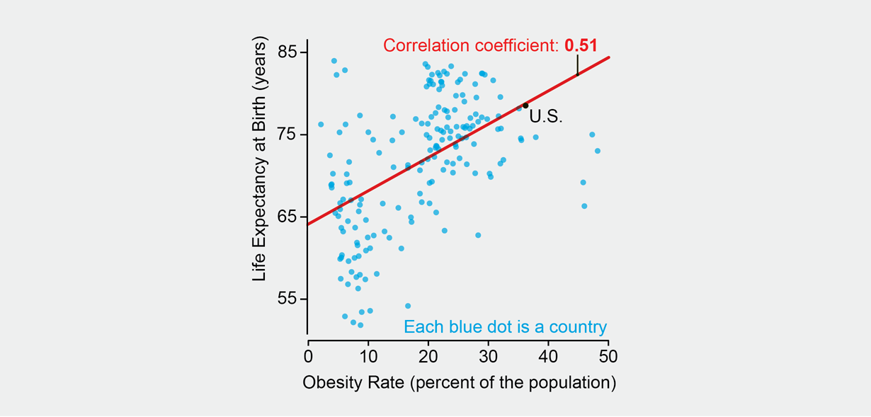
An anonymous reader shares a report: "A picture is worth a thousand words." That saying leads us to believe that we can readily interpret a chart correctly. But charts are visual arguments, and they are easy to misunderstand if we do not pay close attention. Alberto Cairo, chair of visual journalism at the University of Miami, reveals pitfalls in an example diagrammed here. Learning how to better read graphics can help us navigate a world in which truth may be hidden or twisted. Say that you are obese, and you've grown tired of family, friends and your doctor telling you that obesity may increase your risk for diabetes, heart disease, even cancer -- all of which could shorten your life. One day you see this chart. Suddenly you feel better because it shows that, in general, the more obese people a country has (right side of chart), the higher the life expectancy (top of chart). Therefore, obese people must live longer, you think. After all, the correlation (red line) is quite strong.
The chart itself is not incorrect. But it doesn't really show that the more obese people are, the longer they live. A more thorough description would be: "At the national level -- country by country -- there is a positive association between obesity rates and life expectancy at birth, and vice versa." Still, this does not mean that a positive association will hold at the local or individual level or that there is a causal link. Two fallacies are involved. First, a pattern in aggregated data can disappear or even reverse once you explore the numbers at different levels of detail. If the countries are split by income levels, the strong positive correlation becomes much weaker as income rises. In the highest-income nations (chart on bottom right), the association is negative (higher obesity rates mean lower life expectancy). The pattern remains negative when you look at the U.S., state by state: life expectancy at birth drops as obesity rises. Yet this hides the second fallacy: the negative association can be affected by many other factors. Exercise and access to health care, for example, are associated with life expectancy. So is income.
The chart itself is not incorrect. But it doesn't really show that the more obese people are, the longer they live. A more thorough description would be: "At the national level -- country by country -- there is a positive association between obesity rates and life expectancy at birth, and vice versa." Still, this does not mean that a positive association will hold at the local or individual level or that there is a causal link. Two fallacies are involved. First, a pattern in aggregated data can disappear or even reverse once you explore the numbers at different levels of detail. If the countries are split by income levels, the strong positive correlation becomes much weaker as income rises. In the highest-income nations (chart on bottom right), the association is negative (higher obesity rates mean lower life expectancy). The pattern remains negative when you look at the U.S., state by state: life expectancy at birth drops as obesity rises. Yet this hides the second fallacy: the negative association can be affected by many other factors. Exercise and access to health care, for example, are associated with life expectancy. So is income.

.png)
Graphics That Seem *Clear* Can Easily Be Misread (Score:4)
Re: (Score:3, Funny)
referring to mostly transparent graphs overlaid on a background picture
DUDE! Get out of my mind!
I'm waiting for the follow up: "Article headlines that seem clear can easily be misread".
What the shit? (Score:3)
Information That Seems Clear Can Easily Be Misunderstood
ftfy
Re: (Score:2)
See my Signature
Lies, Damn Lies, Statistics, Graphed Statistics (Score:1, Troll)
Statistics is an art not a science. Basically you choose your conclusion first and then you can always gin up the statistics needed.
e.g. A cousin of mine used to work for an economics thinktank in an unnamed country. They try to keep on the good side of the party in power.
They released statistics for the last 5 years showing the economy had grown. Elections happened , the opposition party came to power so they released statistics for the last 10 years which showed over 10 years the economy had stagnated und
Re: (Score:2, Funny)
anecdotes with no backing evidence are even more artistic. let's gamble the future of civilization on your misapprehensions
Re: (Score:2)
As Obama just bought a seaside (really right by the seaside, not even on raised land) villa for $15 million, that sends a pretty clear evidential signal that being cautious around statistics is A-OK.
Re: (Score:3)
Written in 1954, but still just as relevant today. Should be required reading in schools.
https://archive.org/details/Ho... [archive.org]
Re: (Score:2)
Statistics is an art not a science.
Many years ago, "The Economist" published an article on the dangers of extrapolation.
They made a century chart of the amount of blades in a razor. For a long, long time only one.
Then suddenly two . . . then three . . . then four . . . then five over a short period of time.
Their extrapolation showed that we should have like 43 today.
Re: (Score:2)
This drivel has been modded up? Sure, you can work backwards from a conclusion, but then you're not applying the science of statistics, you're just telling an elaborate lie.
Statistics is a science: a series of methods that can be applied to data in order to draw conclusions about that data. Conclusions that have been found to be valid in a wide variety of situations.
And that includes climate, by the way. Climate scientists have no need to fabricate data. Publicly available data from a wide variety of source
Re: (Score:2)
Re: (Score:2)
Thanks to the massive amount of data we have, we know that the climate is variable. What's unusual is the speed and magnitude of the change we're seeing now. In the hundreds of millions of years for which we have climate records, only a few events can be compared, and those were massive meteorite impacts.
We also have a good handle on what can cause climate change: changes in solar output, meteor strikes, volcanic eruptions. None of these can account for the change we're seeing now. There is one factor which
Re: (Score:2)
Even if Global Warming is actually happening, there is no clear science on whether it is actually harmful. All we have is anecdotes on some rich guys coastal property will lose value so we need to stop millions of people from developing using coal.
The cost benefit analysis has been done and been proven that climate change mitigation measures will kill a lot more humans in developing countries than any sea level rise will.
Millions die today due to lack of clean drinking water, sanitation, easily treatable di
Re: (Score:2)
Re: (Score:2)
Even if Global Warming is actually happening, there is no clear science on whether it is actually harmful. All we have is anecdotes on some rich guys coastal property will lose value so we need to stop millions of people from developing using coal.
The cost benefit analysis has been done and been proven that climate change mitigation measures will kill a lot more humans in developing countries than any sea level rise will.
Millions die today due to lack of clean drinking water, sanitation, easily treatable di
Re: (Score:2)
I'd say that this shows that statistics is like a science in that it takes training / knowledge to use it correctly, and that it can be used to mislead non experts.
Use data to ask better questions, not find answers (Score:3)
I normally at work after generate data sets, I try to encourage people not to treat the data as the call to action, but to look at parts and ask more questions about it.
Where in turn you pull more detailed focused data, an helps answer the big question then opens up smaller questions.
For the most part we just want to see a Good vs Bad value. But real life isn't like that.
Unemployment is low. The numbers show that.
However why is it so low?
Are businesses booming and need more workers?
Are the baby boomers retiring at a rate faster then they can fill the spots?
Are we transitioning from a duel income family to a single income family again?
Are people living their lives in moms basement?
Is there an influx of people going to school full time?
Are migration policies working to reduce the workforce?
For the people that are employed, are they working jobs best suited towards their skills?
Depending the answers to the questions, we could be in a really good place, or a really bad one, or it can be a combination of all the answers making a more complex situation where they issues that need to be addressed, while other things are boosting the average.
Re:Use data to ask better questions, not find answ (Score:4, Interesting)
Unemployment is an interesting example. The US Bureau of Labor Statistics releases six different unemployment numbers, called U1 through U6 [bls.gov], based on different assumptions and different definitions of "unemployment". The number always cited is U3, which has an unintuitively narrow definition of unemployment. For example, as I understand it (I don't have a reference for this), anyone who has been paid at least $25 (USD) in the past two weeks in return for labor is considered "employed". And, of course, "discouraged workers", who are no longer looking for jobs, are not counted as unemployed.
facepalm (Score:4, Insightful)
Re: (Score:2)
I only wish it was true.
I recently designed a website (sad, but true). As I used to design data entry screens in Fortran on VT52's, I have been somewhat pissed that high-end Intel mega-cpus on the latest, most incredibly high performance broadband go slower than a Lear-Siegler ADM3A at the end of a 300 baud dial-up line. As data entry systems go, web sites seem piss-poor. I wondered why.
After a couple of days wearing my best
Re: (Score:2)
crappy research (Score:3)
Re: (Score:3)
Seems to be either how we are intrinsically programmed or what we learn after years of x-y plots. It is kind of implied that there's a relationship between the two variables and so we jump right to finding a trendline rather than considering if its a coincidence, both variables are correlated to a 3rd variable that isn't mentioned etc.So in a nut shell I agree, imo (who elses'?) use your words, figure out what the real dependent and independent variables are and then only plot those when presenting things t
Re: (Score:2)
It is kind of implied that there's a relationship between the two variables
More than an implication. They call one axis the "dependent variable" for a reason. If there is no real dependence, then the plot is bogus to begin with.
Re: crappy research (Score:2)
Re: (Score:2)
No, the only thing Albert Cairo did was fool the editors of a semi-popular magazine into paying him for writing a silly article.
Even stupid people don’t believe being fatter is healthier. If you show them that graph, their likely takeaway is “science is stoooopid cuz it thinks fatter people be healthier”.
Wow. News for nerds... (Score:1)
Re: (Score:2)
Graphing a correlation doesn't even prove a meaningful correlation exists. If the best you can do is to draw a line through a blob of dots and quote a low correlation coefficient (i.e. less than ~0.7), then it means you haven't properly isolated the variables and drawing conclusions from those trends is more likely to be just confirmation bias rather than a meaningful trend.
Lies, damn lies and statistics (Score:3, Informative)
Do not overinterpret results (Score:5, Insightful)
Correlation is not causation.
NONE of the graphs in the article show anything other than a correlation. If the correlation fits your expectations, then you will have a tendency to believe it. You should only believe the presented results when they have been shown to represent a causal link. Causal links are really, really hard to show without controlled experiments, and observational results (i.e., those without experimental manipulation and at least one control group) in general fall short.
Repeat after me: correlation is not causation.
Re: (Score:2)
And incredibly weak correlations in noisy data is definitely not causation.
Re: (Score:1)
Re: (Score:1)
The title might lead one to believe that... (Score:2)
... this would be a story about how Edward Tufte might have been all wrong about charts. Instead it turns out to be more about the phenomena that the unknowing reader can be swayed by a fancy chart depicting highly questionable conclusions. "Oooh! Pretty colors! I can eat anything I want and live longer!"
This article [theinnovat...rprise.com] doesn't have the prestigious name of SciAm associated with it but it says much the same thing. (Geez... I recall when I subscribed to SciAm back in college that the articles were significant
Modern problems need modern solutions (Score:2)
Now, where'd I leave my Whopper?!
Comment removed (Score:4, Informative)
Re: (Score:3)
Re: (Score:2)
According to the radio show "Under the Influence [www.cbc.ca]", the gecko was created because "a Screen Actors Guild strike prevented advertisers from using live actors."
"Visual thinkers" (Score:2, Insightful)
That always irritates me. It's not that visual thinkers don't exist, it's that people who describe themselves that way are usually just too lazy to do much thinking at all. They like pictures because they can glance at them and jump to conclusions. If you draw them a diagram and ask them to study it, they'll almost always fixate on some irrelevant graphical presentation detail.
Funny Road Signs? (Score:2)
That always irritates me. It's not that visual thinkers don't exist, it's that people who describe themselves that way are usually just too lazy to do much thinking at all. They like pictures because they can glance at them and jump to conclusions.
Wait? What? You mean this road sign isn't for a place where I can go to have something heavy dropped on my vehicle? [123rf.com]
Re: (Score:2)
How about those boxes with the icon sequence umbrella, cracked champagne glass, up arrow? They could be read as "In case of rain, drinks will be served upstairs."
Simpson's Paradox (Score:4, Interesting)
... happens with dissimilar groups are improperly aggregated into one group when analyzing data. Like this: "... a pattern in aggregated data can disappear or even reverse once you explore the numbers at different levels of detail."
So how do you know which groups are "dissimilar"? That's one reason why study design and analysis are hard.
An excellent reference (Score:2)
Re: (Score:2)
Or you can cut out the middleman and buy direct from the author [edwardtufte.com].
So we've shown that the primary usage scenario... (Score:2)
Wait... (Score:2)
...are you suggesting that data can be misrepresented by graphs? Or that people jump to simplistic conclusions?
No, that's simply impossible.
A Mathematician Reads the Newspaper (Score:2)
I read this years ago, and how I read and interpret news, statistics, charts, polls, and other numerical claims has been different ever since. It's filled with a great many examples with clear explanations of how a chart or claim could be both true and misleading.
With this background and an understanding of confirmation bias ( https://en.wikipedia.org/wiki/... [wikipedia.org] ) I've made sure to double-check any stats or charts that not only seem fishy, but ones that either seem too
Not news: Correlation is not causation (Score:2)
Example was Correlation Not Causation (Score:2)
The given example showed that countries with a higher obesity rate had a higher life expectancy.
This is not a problem of bad graphics, but instead a clear case of Correlation not equaling Causation.
In this case, the explanation was simple - both obesity and life expectancy are highly correlated with wealth of the country. The wealthier the country, the more food they had, so a higher obesity rate. Similarly, the wealthier the country the better the medical care and more importantly, education, both of whi